I combined skills in design & writing to explore a unique intersection of personal identity.


Display at the gallery show “Generous Feedback”

The goal of this project was twofold: first, highlight the stories that inhabit the intersection between LGBT people and faith; second, use those stories as a jumping off point to talk about the messiness of defining personal identity. To me, this work filled a void in discussions of both LGBT and religious experience. The questions that arise at the intersection of these two identities are unique and deserve their own space.
I worked individually on the project under an advisor. Over the course of 5 months, I interviewed 12 volunteer participants, edited the interviews for readability, designed the visual system for the project, and designed each individual book.
Winner of the 2018 Victor Ng Design Impact Award.
ROLE
Lead Designer & Interviewer
SKILLS
Narrative design, layout design, print design, color, typography, curation, visual storytelling, interviewing
TOOLS
Adobe InDesign, Adobe Illustrator
DURATION
5 months

Balancing respect, impact, and empathy—
Stage one of this project was interviewing people willing to share their stories. In the end, I interviewed ten people, with several more interested for future iterations of this project. Participants were from a variety of backgrounds, genders, sexualities, and faiths.
Each interview was audio recorded and eventually transcribed. After that, I edited the interviews down for clarity (cutting things like placeholder words, repetitions, and identifying information). The conversation flow was also streamlined enough for a third party to follow it. Overall, this process took about two months.
VISUAL SYSTEM

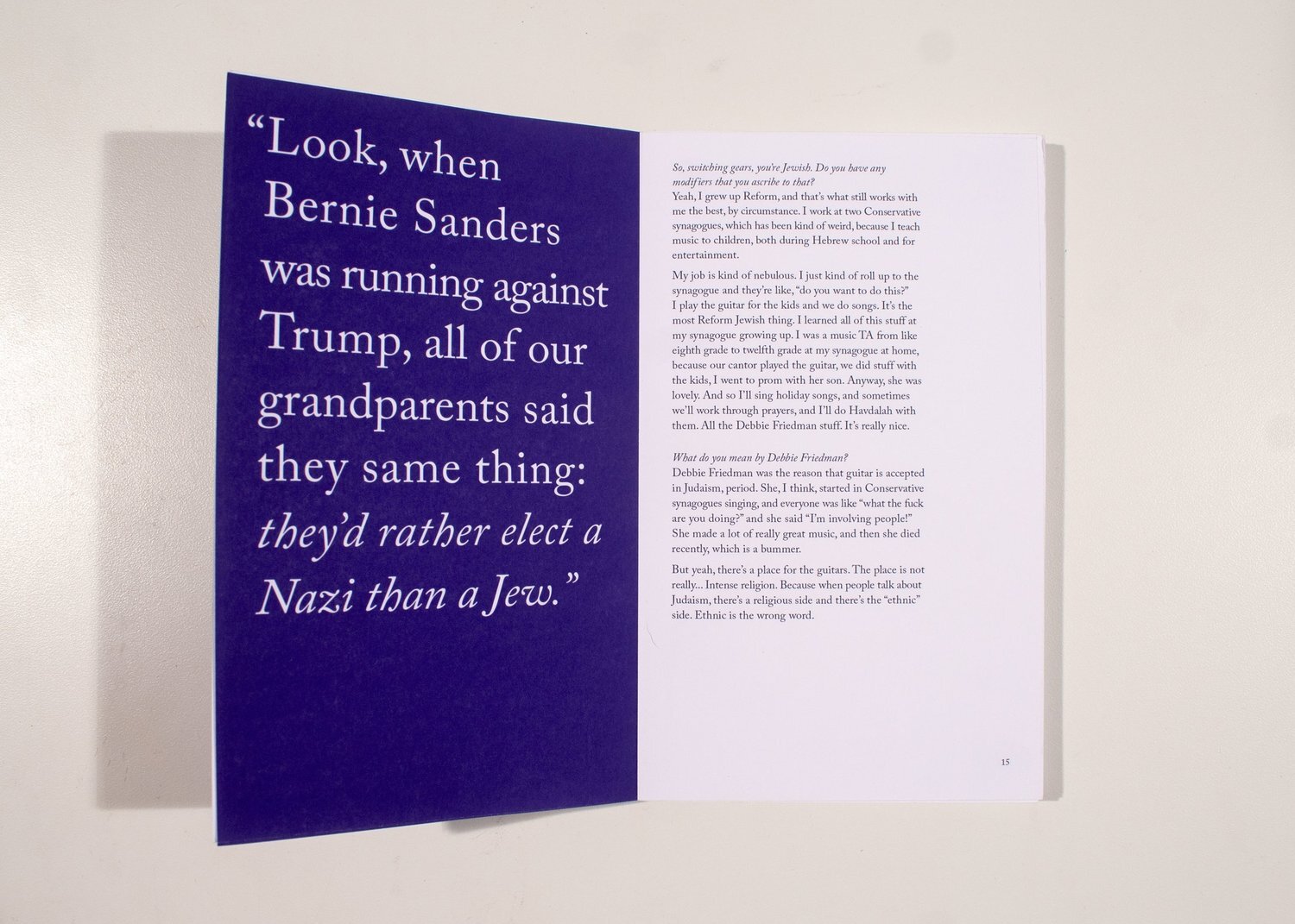
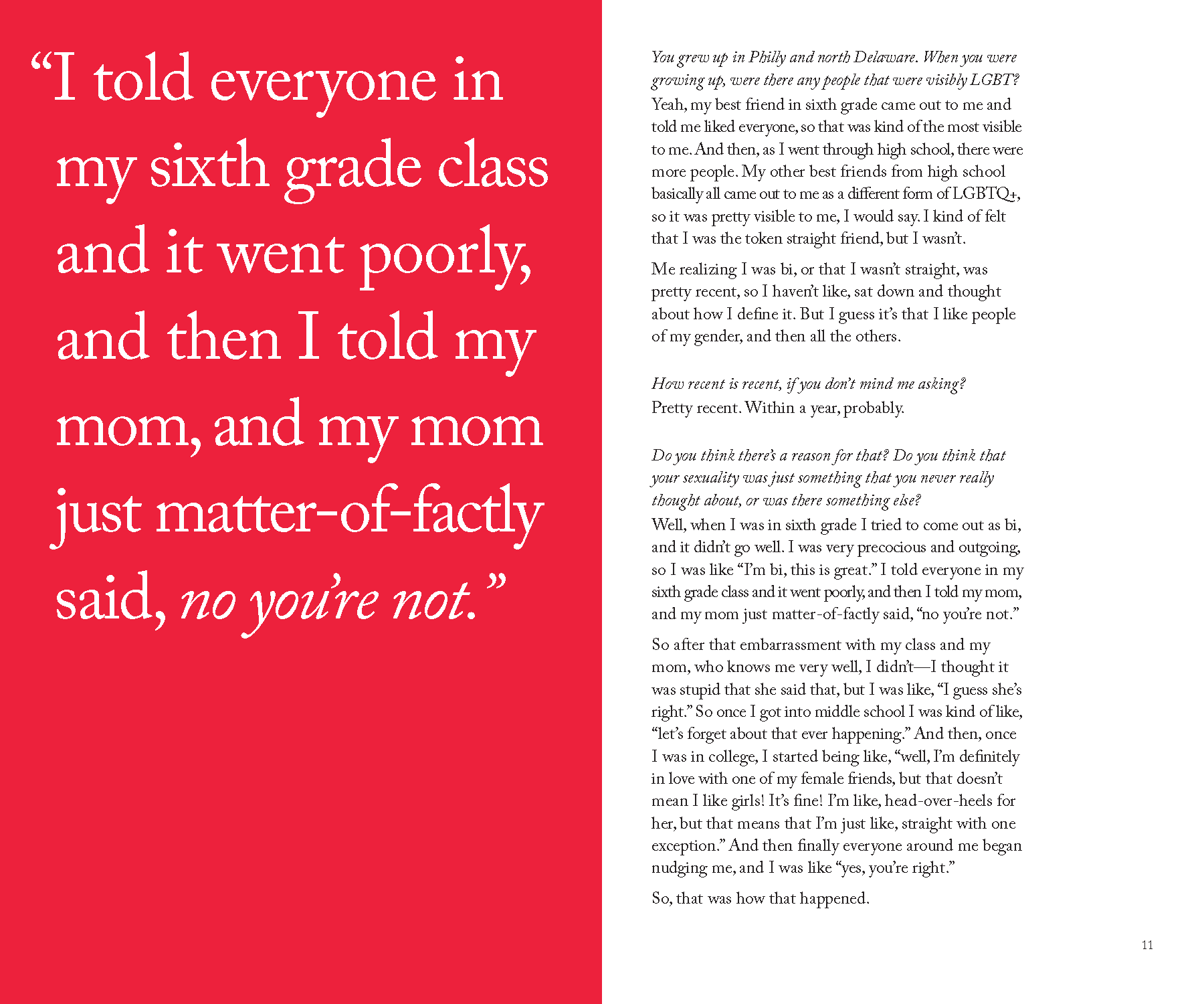
The color scheme is derived from the original Gilbert Baker design for the LGBT pride flag.

Adobe Caslon is serious and professional without being stuffy, readable in large paragraphs at small sizes, and visually interesting for pull quotes.
I began the design process in parallel to the interviewing process. I began with font and color studies to find the project’s tone. Originally, the colors were more muted and the form was one longer anthology. Early on, I realized that each interview needed its own moment. Cutting them up and combining them undercut their power.
However, an anthology wasn’t working. A bigger work, both in length and dimension, dragged too much, and the muted colors weren’t helping. This led me to switch to smaller books, so each interview really was a self contained moment and story. A whole person.


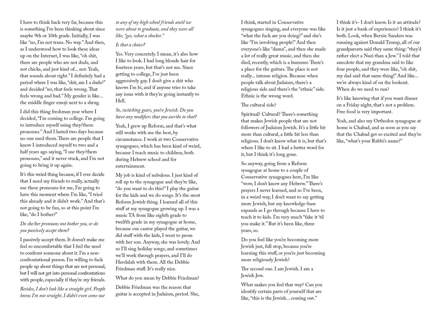
An example of a transcript...

...and the spread it became.
Finding the balance between respecting the stories of my participants and understanding my role as a designer took some time. Through this process, I realized that I could both honor the truth of these interviews while still having a clear voice. By categorizing the interviews with the labels of family, love, spirit, etc., I showed the different ways in which identity can manifest.
Personal voice was another important element to this project. I made my role as a designer and an interviewer, a facilitator of this experience, evident in the text. Each book has a dedication in the front to someone or something important in my life, and each book starts the moment before the interview begins. Before readers live in the moment of my participant, they’re sitting with me.


Discarded cover spread ideas and an example of the old palette

Early single-book draft

Early type studies
Type study for discarded anthology idea

Early typography experiments