I designed & developed the website for ADA at 30, a journalism project looking at accessibility in Pittsburgh.


The Americans with Disabilities Act was signed into law on July 26, 1990. For its 30th anniversary, news organizations PublicSource and Unabridged Press wanted to know: how has the ADA changed life for Pittsburghers with disabilities? And what progress still needs to be made?
I designed and developed the project’s website, which hosted stories, first-person essays, video, and podcast content. I also conducted accessibility testing with a range of users with disabilities, to ensure the site design was intuitive, clean, and accessible to everyone.
ROLE
Designer & Lead Developer
SKILLS
UI/UX Design, visual storytelling, accessible design, responsive web design, branding
TOOLS
HTML5, CSS, Javascript, Adobe Illustrator, Adobe Photoshop, NPR’s interactive template
DURATION
5 months
See the website
PROCESS OVERVIEW

From the beginning, I needed to design with accessibility in mind—
Doing accessibility research up front left me freer to be creative within any accessibility constraints. Through reviewing the WCAG guidelines and the best practices from independent organizations like the W3C, I complied a few key research takeaways:
Allow room for customizing text, contrast, and colors wherever possible
No important information can be revealed on hover
Video/audio autoplay should not be used
Color palette should include contrasting colors that are colorblindness friendly
VISUAL SYSTEM

Bright, positive color scheme for a celebratory project.

Fonts are open, friendly, and vetted for readability.

Images emphasize themes of voice, creating space, and making the invisible visible.
The visual design is friendly, positive, and open. Overall, this project celebrated thirty years of progress.
The color scheme was bright and positive. Colors were also vetted for contrast and colorblindness. Priority information was displayed in bright blue: the most colorblind friendly color.
Mallory is an open, friendly font, which also helps with readability. Futura PT’s distinct leaders are both accessible and modern. Garamond’s serifs make letters more distinguishable in body copy, and work tonally for stories and essays.
The project logo shows the disability community creating space for themselves among their abled peers. It also highlights the invisibility the disability community often faces.
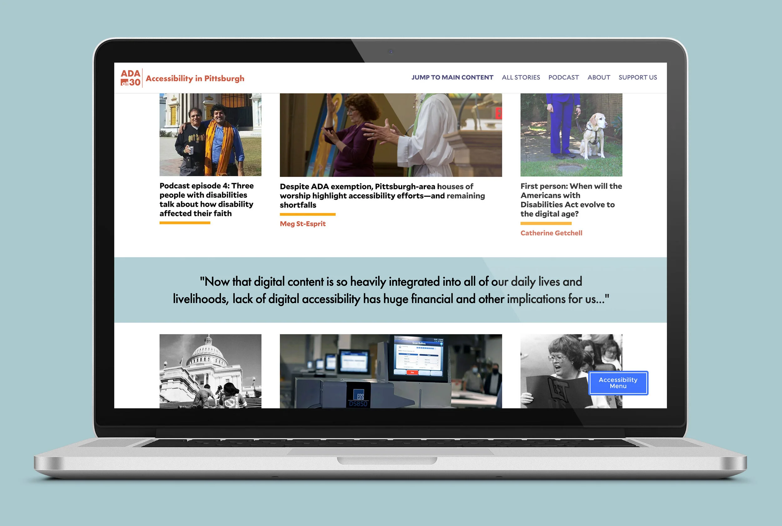
Finally, a key aspect of the this project was amplifying the voices of many Pittsburgh residents with disabilities. Close to 50 different people with disabilities, and their advocates, participated. This is one of the project’s biggest strengths, and I highlighted that by prominently featuring our contributors’ photos.
WIREFRAMES


The site layout is conversational. Like the project, it highlights multiple voices and perspectives.
This project utilized NPR’s news apps interactive template as a base. It’s a news application generator based in NodeJS. The template integrated with Google Docs using Google’s API. Journalists could write and update their stories in Google Docs, and as the developer, I could pull in their updated content and plug it into the layouts I designed and built.
The site layout had three “content hubs”: a landing page with the latest stories, an “all stories” index, and a podcast index. In addition to the indexes, I designed and built base layouts for four different types of content: stories, videos, podcasts, and transcripts, with HTML, CSS, and JS. These templates were independent blocks that I could slot into individual pages as needed.
For a full breakdown of the development-side of the project, and to take a look at the project’s code, please view its Github repository.


Customization options are better than a one-size-fits-all solution
For additional accessibility features, I implemented the Userway extension across the site. Userway allows for individual customization, with features like text adjustments, keyboard navigation, and increased contrast. This addressed on of my key research takeaways: customization options are preferable over attempting a one-size-fits-all solution.
However, Userway alone did not meet accessibility requirements. To ensure the site hit that threshold, we needed to do accessibility testing.

We also included a contact form throughout the site to easily address accessibility concerns.
A walkthrough of the Userway extension on a story page.
We ran testing with users with disabilities to mitigate any accessibility issues before launch
45-60 MINUTES BLOCKS
We asked users to perform tasks like test stories and multimedia players, try Userway’s functionality, and contact us. We also asked what digital accessibility tools testers regularly used.
VIRTUAL TESTING
Due to COVID-19, all testing was done over Zoom with screen sharing.
EYE TO MULTIMEDIA
We paid special attention to multimedia content and supplemental transcripts, captions, and screen reader functionality, since the team lacked that firsthand experience.
VARIETY OF TESTERS
Participants included individuals with hearing, vision, and cognitive disabilities.
SOME OF OUR FEEDBACK
While all of our videos and podcasts had subtitles and transcripts, we were missing vital closed captioning information for Deaf and hard-of-hearing users. We went back and included information conveying tone and supplemental information like music and periods of silence.

Our links were initially styled in the same red color as our logo. Red/green colorblind users, the most common form of colorblindness, could not distinguish between dark grey text and red links, so we switched the color to blue.
Several users couldn’t find Userway, and others were thrown by its interface. Their reactions showed us that we needed a new way to onboard users to the menu. By explicitly labeling it “accessibility menu” and introducing users to both the project and Userway at the same time, we significantly improve this experience.
The project connected with the community
Content was released on a staggered two week schedule leading up to July 26th: the actual date of the 30th anniversary. The project drew in new readers outside of PublicSource and Unabridged Press’s typical audience. Activists, community leaders, and local politicians all engaged with and shared our project.
The site saw nearly 6,000 users in those first two weeks, and various stories from the project were shared over 100 times on social platforms like Facebook, Twitter, and Instagram.
Our accessibility research and testing was a resounding success. To date, we’ve only received one accessibility concern, which I quickly rectified.
