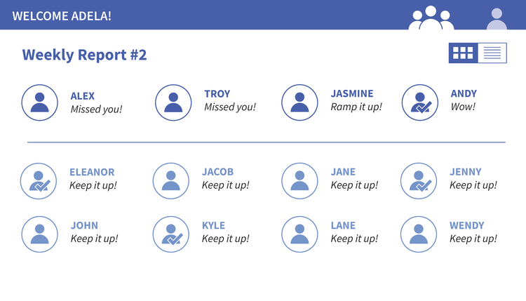
My UI/UX work on LearnSphere’s digital tools increased their intuitiveness and helped reach a larger audience.

LearnSphere is the project heading for a suite of analysis tools focused on analyzing educational data. These tools scaffold data analysis so educators without learning science backgrounds can analyze their curriculum data, and then use those findings to more effectively teach students. The analysis tools are also often used by learning scientists themselves to further their research.
I worked as the sole UI/UX Designer on the LearnSphere team. My role including updating the UI of their flagship tool: Tigris, designing new interfaces for their upcoming digital products, and conducting user testing with current and potential users to expand their audience.
ROLE
UI/UX Designer
SKILLS
UI/UX design, user interviews,
rapid prototyping, web design, development
TOOLS
Adobe Illustrator, Adobe Photoshop, HTML/CSS, Javascript, InVision
DURATION
3 Months (Internship, full-time)
9 Months (Contractor, part-time)
Fixing old interfaces: Tigris workspace redesign—
LearnSphere’s flagship tool, Tigris, was created to make data analysis more accessible to non-learning scientists. In Tigris, users can create “workflows” that utilize different analysis models on their data. The interface didn’t reflect this desire for accessibility.
Important functions were hidden, simple actions required many clicks, icons or buttons were unclear, and the interface itself was crowded. Additionally, the UI visual language didn’t tonally match the tool’s function. It looked juvenile, with whimsical patterns and bright/neon colors. The UI was also low contrast and had small text that was difficult to read.
To address these problems I simplified the interface, prominently featured icons over text labels for basic functions (such as saving and running workflows), streamlined the visual language, and generally gave the UI a more adult visual tone.

Old component workflow space
Alternative color explorations, mocked up in Photoshop


REDESIGNED WORKSPACE

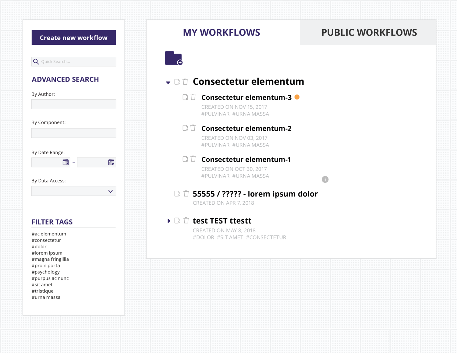
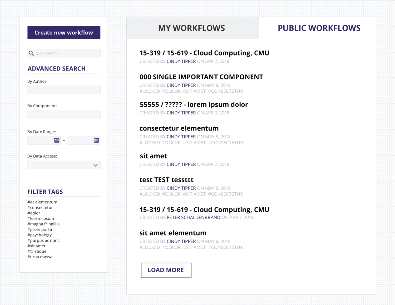
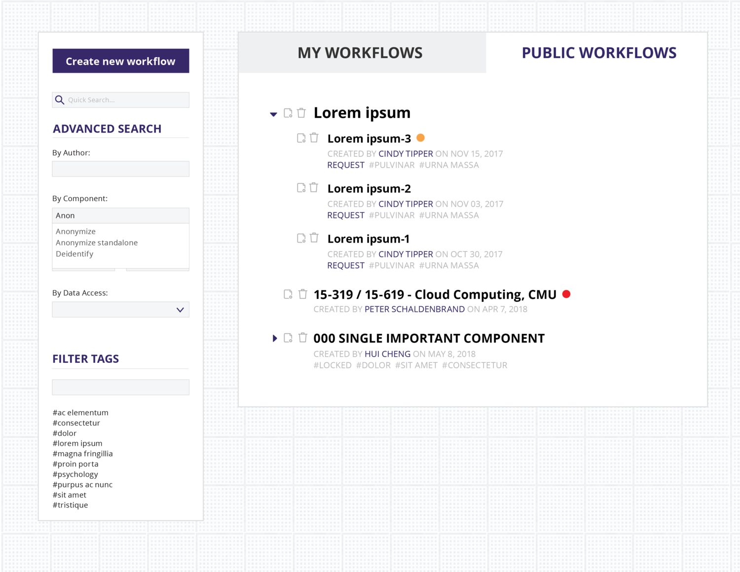
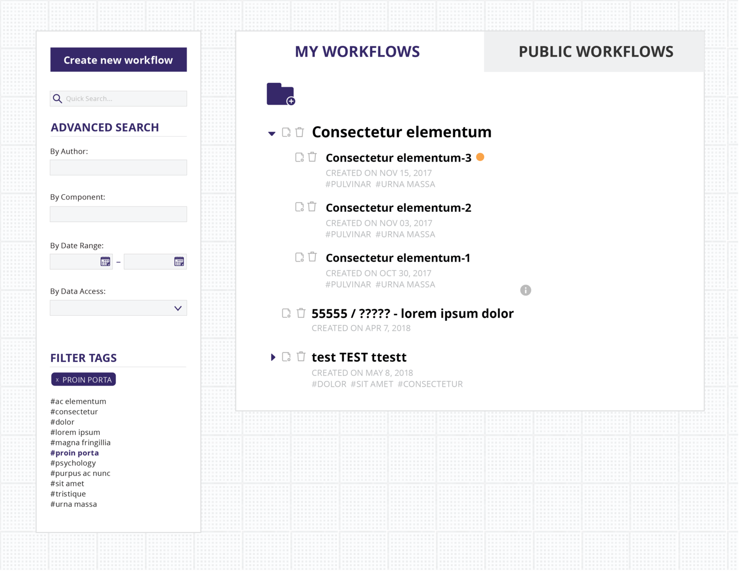
Fixing old interfaces: Workflow list redesign—
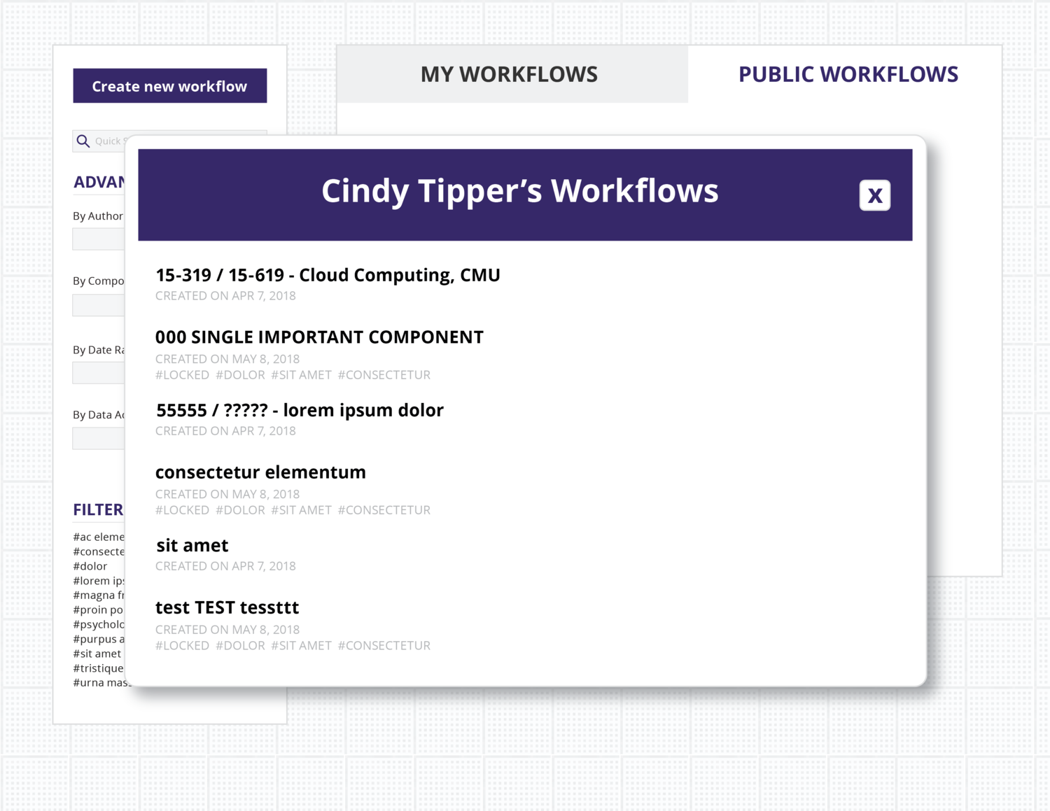
The LearnSphere database is a semi-public space. Users can choose to share their data analysis workflows with other users (often for research collaboration), and these workflows show up on a public list. Users can also see their personal workflows on this page, public or private.
Before my redesign, the workflow list was essentially a reverse chronological list of public workflows with minor searching capabilities. I adding a tagging system and advanced search. I also redesigned how users see workflow metadata, like date edited.
Finally, the red/green status icons tell the user whether the workflow in question has an error. Previously, users would need to load the workflow and all of its data in order to view that information. The result was an overall easier searching experience.

Old workflow list
ILLUSTRATOR MOCK-UPS OF THE FINAL DESIGN (CLICK TO ENLARGE)

Designing new interfaces—
My most recent project at LearnSphere was to develop a tutoring tool aimed at catching students up in math and science. It utilizes the same data science back-end as Tigris.
The project is ongoing. Below are screens from the latest mockup.